For the past few months, we have been creating and developing ideas towards our final media product ( Horror film opening). During this journey, I have progressed in my knowledge of film openings, particularly regarding the Thriller/horror genre, discovering key codes and conventions of this genre, and how marketers appeal these products to their target audience. By researching other horror films, we have been able to use their ideas and conventions to influence our own final products.
In what ways does your media product use, develop or challenge forms and conventions of real media products?
We were very pleased with the final outcome of our Horror film opening. During the course of this project based on Horror/Thriller genre, we were able to research key codes and conventions used in these genres and were influenced by the concepts, including the ideas into our final piece. By looking at various film openings from all different genres, whether that be horror, romance, comedy or action, we were able to see how an average film opening is represented and what media techniques it uses.
We started off by looking at general film openings, and writing down denotations and connotations for each example. We discovered that nearly all films from a variety of different genres all shared things in common, i.e. they would all include the film’s title, along with short credits displaying the names of the main actors, directors and producers. They all also tended to give an immediate sense of story line and are instantly introduced to the genre of the film as an audience. For example, in the opening few minutes of ‘The Dark Knight’, we are bombarded with fast paced action, destruction, weapons, murder and a sense of a dark, sinister plot. This is typical of an action adventure film.
After briefly looking at the key codes and conventions of film openings, we were given cameras and told to go around taking organised shots of particular camera types/angles included in these film openings. This particular activity gave us a chance to dig deeper and have a more detailed look into camera angles and why they are so important in a films as a whole. We took various shots including high angle, low angle, establishing, close up, extreme close up, long shot, mid shot, two shot, aerial shot, mid shot etc. After taking our own shots, as well as looking at examples of them used in film, we revealed why they were used and what importance they had. Two camera shots which are commonly used in horror films are the low angle shot and the high angle shot. These two angles, when used in the correct pretence are very visually effective and rub off on the viewer. A low angle shot is commonly used when showing the villain. The shot allows them to look, bigger, more powerful and superior, giving them control and making them seem intimidating, which helps create anxiety and apprehension in the audience. The high angle shot is commonly used when depicting the victim, making them look small, hopeless and vulnerable. The establishing shot often depicts an average looking house in the dark hours of night. The use of an run-of-the-mill, ordinary home relates to the audience, whilst eliciting fear and unease as it suggests that terrible events can happen in the most normal, safe places in anyone’s life. We integrated the use of this shot into our final horror film. The scene was clearly shot at night time, creating a sinister, dark atmosphere. Some other important shots we looked at where the 180 degree rule, shot/reverse shot, over the shoulder shot etc. These particular angles we noticed were commonly used in horror films. We were to develop these shots and include them in a preliminary task to see if we could recreate them in a way that was effective.
I focussed on 3 particular horror film openings (Halloween, Sweeney Todd and scream), analysing their techniques and connotations which linked them to the genre.
We then progressed from the general conventions of horror to their production and audience. I researched in depth the twisted pictures production institution which is responsible in creating many of the successful, good quality horror films out to date. This then lead to looking at the target audience of the horror genre, and how they were marketed towards them. I developed these ideas in my target audience profile which I thought would be an appropriate market for our horror film.
How does your media product represent particular social groups?
After researching various horror movies, we looked at the ways in which different social groups are portrayed. We noticed that the victims are usually portrayed as being young, female or groups of people in the teenage age range. Using people of this social group that are more dependant and inexperienced creates a sense of vulnerability and naivety, causing them to be suitable and fitting as the casualty.
Whilst looking at the horror genre, we were struck with the realisation that a large majority of villains were male, whilst a large majority of the victims were female. This is usually so as the male gender are generally seen as the stronger, more dominant sex, whereas females are seen as weaker and inferior. This idea is a very old fashioned notion and to allow our film to fit in with modern times and appeal to a younger audience, we felt it was necessary to include a major twist in our storyline, using a male victim and a female killer. This turn of events creates a new, interesting look on gender, appealing to both a male and female audience. The male audience can relate to the male character and also enjoy the aspect of a dominant, independent woman which is very appealing and provocative. The female audience may feel a slight distance from the female killer, but enjoy the fact that the female character is in control. The female killer in our film uses her seductive nature and provocative allure (represented by the sleek, red high heel shoes) to rein power over the male victim.
What kind of media institution might distribute your media product and why?
In our final horror movie opening, we have decided to use Warner Brothers and Twisted Pictures as our main film institution labels. We made this decision together in our group, as we felt these particular production companies were suitable and would benefit our final product.
Twisted Pictures is an independent production company, who specialize in producing films of the Horror/Thriller genre- particularly famous for producing the Saw series. Our film falls perfectly under this category so would work well together. The fact that this institution is well known for other, successful horror films gives our film advantage, maybe attracting the attention of fans of this institution and films it has previously produced. The company was only founded in 2004, and is therefore relatively new, which adds to our concept of a fresh, new film for our modern, young audience.Warner Brothers is also a hugely successful company name, and could attract a lot of attention towards our film.
Who would be the audience for your media product?
After researching the way in which products are sold, the most important aspect is determining its specific audience at which it is aimed. The target audience range of the genre of horror, are males between the ages of 15-30. We therefore decided that it would be appropriate to aim our film at the same demographic. After researching on the internet, reading the listing figures of horror films and their audiences, I was lead to believe that this was the appropriate age range and gender. I also made some primary research, creating questionnaires and surveys concerning horror as a genre, finding out what people of different age ranges and social groups felt about it. Most of the participants who had a particular interest in horror were revealed to be in the age range of 15-30 and male. Our film centres on the main character, Mark, a successful young male in his twenties, who the main audience could hopefully relate to and feel a connection with. We have daring decided to use a female killer, may not appeal directly to woman, but the independent, powerful representation of women may be alluring and attractive again to the male audience.
A film always has a secondary target audience (people who are in the room whilst the film is on or accompanying a member of the target audience) for our film would be couples (male of 15 years + accompanied by other half) and gangs of friends (older teenagers +) watching the film together. After questioning 10 people of the audience age range, 80% prefer to watch horror films with other people, as it gives them a sense of security and feel safer than if they were viewing it alone.
How did you attract/address your audience?
We used various techniques and decisions throughout the process of creating our horror film to allow it to relate to our target audience
Our main character, mark, is an everyday average teenage boy (the prime example of our target audience). We dressed him in a smart suit to show that he is a member of a college/sixth form. The normality of his being and appearance makes the events throughout the film even more dreadfully haunting as the target audience has been allowed to form a bond and relate to him as a character, causing them to sympathize and identify with him.
We have shown Mark carrying out various every day domestic tasks such as making a cup of tea and watching TV. The violent scene which we have shown on the TV screen almost foreshadows the dark, sinister events to come, as well as engaging the audience in the film, showing them that the character performs everyday tasks out of the norm, not knowing his wicked awaiting fate. The intertextuality of including a scene from another successful horror film, Sweeney Todd draws in the attention of the audience, declaring that this film is suitable for them as it contains a scene of a different film from the same genre which they may already be a fan of.
By looking at my recorded results from my horror genre surveys, most of the people said something along the lines that the thing they most enjoy about horror films is the building of tension, as opposed to the actual outcome after the climax. We tried to create as much tension as possible in our horror opening, including eerie, unnerving music and camera shots such as over the shoulder shots, giving the feeling that our victim is frequently being watched in the safety of his own home, stimulating panic in the audience.
Another aspect of attracting our audience to our film would be through the medium of advertisement.
Movie posters/ print advertisements which could be included in magazines, billboards, newspapers etc could be created to promote our films release. I would hope that they would appear in magazines such as film or horror magazines as they would have a similar target audience to that of our film.
The target audience of our film is largely populated on social networking sites such as facebook, twitter and myspace. Accounts could therefore be created on these various sites to ensure maximum exposure to the public eye through the source of the internet, one of the highest form of advertisement in the media.
Another great way to advertise cinema releases is through television trailers. We created a trailer for our film using the ‘I movie’ software on the Mac computer. The perfect place for the trailer to be shown is on film channels, horror channels and any channels not associated directly with children due the explicit content.
What have you learnt about technologies from the process of constructing this product?
For me, the editing process of our film was the most difficult section of the course. I felt this was due to the fact that I was unfamiliar with the software of which we had to use. As I had never really used an editing programme before, I struggled with the concept and found the process very challenging, but my group and I worked together to face any problems that came our way and managed to solve them efficiently. After the process of using these new softwares i feel more confident and able when it comes to editing.
We used various cameras throughout the process. We used a digital camera for our preliminary exercise. This was easy to use and was sufficient to our filming needs. Whilst filming both our preliminary task and our horror film opening, we used a tripod, which kept the camera sturdy and made the filming look more professional. For our horror film opening we used the program Final Cut Express, however, for our preliminary task we decided to use’ I movie’, a simple and easy editing program on the Mac computers. Although ‘I movie’ may not be as developed and have as many editing applications as Final Cut Express, it was a simple, easy way to edit our film and contained all the necessary elements which we needed to edit our prelim, i.e. a timeline, allowance to cut down clips, transitions between each clip (which added to the continuity and gave the whole project a steady flow).
In the early days of filming our film opening, we decided to use emmas video recorder, as it produced HD sound and picture, which would give us a professional quality to our film work. We did not realise until we plugged it into the school computer however, that the camera was unrecognized and this was an extremely frustrating obstruction. After converting the videos so they operated with the school computers, we began the editing process.
Formerly, we had edited our movie on as we were all familiar with it as an editing program and thought we would be able to use it with ease. However after a short while we realized it was not the right method to use as it has very limited edits and looked like an armature attempt at editing. In one of our media lessons, the school technician gave us an introduction to a piece of software on the Mac computers called, ‘Final Cut Express’. This was perfect for our film as it had much more advanced tools and was available on the school apple Macs.
Whilst recording our film we worried that we would need to sound dub parts of our film, as well as the fear of additional unwanted noise created by the sensitive recorder of the camera. This was not an issue as the sound quality was of good quality. I enjoyed experimenting with different soundtracks to include in our opening. We used previews of suitable tracks on ITunes, recording them and importing them to play over the video on Final Cut Express.
The soundtracks we used were vital as they incaptured the atmosphere of the scenes, as well as adding tension and eliciting fear from the audience. We included sound bridges and repeated some of the tracks numerous times which covered up the moments where one track changed to another.
I feel that we progressed from ‘Windows Movie maker’ and ‘Imovie’, getting used to the sorts of tools and edits that were present in Final cut Express, as well as additional methods and tools. This program was much more up-to-date and technical, allowing us to experiment with many different techniques in improving our final product. This program included a large variety of transitions, fonts and settings such as colour level and saturation editing which made our finished piece look very professional and of high quality when completed.
Looking back at your preliminary task, what do you feel u have learnt in the progression from it to your final product?
When looking back at my preliminary task at the start of the course, I realise how much I have progressed and learnt from the whole experience and journey. Before we started this course I was completely unaware of any editing softwares and feel that I have now developed to the level where I am confident in using them and feel I can make an effective, high quality piece of material when using such programs such as Final Cut Express.
I feel as a group we developed the most during the editing stages on Final Cut Express. Instead of the simple, bare minimum editing that was available to us on Windows Movie Maker, The extended line of options on Final Cut really helped improve the quality of the final outcome. We progressed with our editing skills on this porgram, not only importing and placing onto a time line and cutting down to desired size, but also adding and downloading appropriate sound effects and soundtracks and adjusting colour levels to add to the atmosphere of the scenes.
Although this program was difficult to use at the start and took a long time to create our final product, It was worth while, and ended up creating our final film opening of great quality and professional standard.
I have also learnt a lot about different camera shots, how and why they are used in creating a certain mood or atmosphere to a piece of film. I feel by developing my new knowledge of camera angles, and actually putting them into action by shooting my own examples has extended my awareness of how important they can be in a scene of a film. Spending a majority of the time filming on various cameras has got me used to the filming process, as well as techniques and additional equipment used to enhance the quality of film work, I.e., a tripod to create a steady, stable level for the camera.
We had brainstormed different ideas for the vague narrative of our preliminary exercise, but in the end felt that an interesting storyline to pursue was one that linked to our ideas for our main task. The story is set after the events of our film, where the killer has escaped from the mental asylum of which she was the number one most dangerous patient. We set the story line and script as to include all of the 3 vital camera shots. We felt this was a good way to practise and experiment with conventions and codes of the horror/thriller genre.
I am happy that we were given almost a 'practise run' in the form of a preliminary task. This gave us an insite to what was expected of us when creating our main task and permitted us to progress a long way and create a highly professional looking final Horror film opening. When looking back to the whole concept of our preliminary task, I feel it could be hugely improved. However, we have developed our main task by creating a strict filming schedule, making sure our scenes were filmed in appropriate locations ( dark, menacing, intimidating woodland) and making sure they were filmed at appropriate times (night time so there was a more threatening, dark atmosphere). We paid clear attention to detail when filming our opening and think this paid off in the end, leaving us with a high standard of professional work. I am extremely satisfyed with our main task and feel as a whole process it was a success.
Sunday 19 February 2012
Thursday 16 February 2012
Target Audience FeedBack
As a group, the next step was to get feed back from our fellow peers regarding our horror film opening. We each showed a selection of people our horror film and asked for their feedback, using questions that we created together as a group. We then recorded our results in a survey like form. We made sure ask members of people that fell under the category of our target audience and secondary audience. Here are their opinions and views regarding our opening:
1. Could you tell that this was the opening to a horror film? How?
Callum: Yes, the eerie music gave it away
Charlie: Yes, the innocent victim being tied up and trapped gave the feeling that something dark and sinister was behind it all.
Lauren: Yes, the victim looked scared, agitated and frightened which rubbed off on me and made me feel uneasy which is typical of a horror film.
Emma: Yes, the dark, dull colours suggested a dark, scary atmosphere
2. What elements of the film did you enjoy?
Callum: The build up of tension helped by the music, and the normal daily routine
Charlie: The camera angles were used appropriately, i.e high angle shot used to make the victim look innocent and helpless
Lauren: I liked how the killer was kept under wraps - allows an air of mystery which is much more scary and effective
Emma: I liked how the eerie music built the tension
3. What elements did you think could be improved?
Callum: The night scenes should have been made brighter as it was quite hard to see what was going on
Charlie: Some of the scenes could have been cut shorter - the daily routine was a bit tidious
Lauren: A bigger variety of music/sound effects could have been used
Emma: The narrative was slightly confusing due to the past and present scenes. Maybe the past scenes could have been shown in black and white to decipher the difference
4. Would this opening make you want to watch on?
Callum: Yes, very gripping narrative
Charlie: Yes, the mystery of who the killer is urges you to keep on viewing
Lauren: Yes, it could be interesting to find out why the victim is in this situation
Emma: Yes, to find out if the victim manages to escape the mystery villian
5. Were there any particularly scary parts in the opening? If so, when?
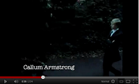
Callum: Yes, When mark turns out the light and there is silence. It made me hold my breath as i didnt know what was coming next.
Charlie: Yes , When you see the heels walking towards mark. You hope he doesnt get hurt as you have already grown a connection with him
Lauren: Yes, when the hand is gradually nearing the camera, like a point of view shot as if you feel like the hand is reaching out for you
Hannah: Yes, when the camera follows mark through the trees and bushes, as if he is being spied on
1. Could you tell that this was the opening to a horror film? How?
Callum: Yes, the eerie music gave it away
Charlie: Yes, the innocent victim being tied up and trapped gave the feeling that something dark and sinister was behind it all.
Lauren: Yes, the victim looked scared, agitated and frightened which rubbed off on me and made me feel uneasy which is typical of a horror film.
Emma: Yes, the dark, dull colours suggested a dark, scary atmosphere
2. What elements of the film did you enjoy?
Callum: The build up of tension helped by the music, and the normal daily routine
Charlie: The camera angles were used appropriately, i.e high angle shot used to make the victim look innocent and helpless
Lauren: I liked how the killer was kept under wraps - allows an air of mystery which is much more scary and effective
Emma: I liked how the eerie music built the tension
3. What elements did you think could be improved?
Callum: The night scenes should have been made brighter as it was quite hard to see what was going on
Charlie: Some of the scenes could have been cut shorter - the daily routine was a bit tidious
Lauren: A bigger variety of music/sound effects could have been used
Emma: The narrative was slightly confusing due to the past and present scenes. Maybe the past scenes could have been shown in black and white to decipher the difference
4. Would this opening make you want to watch on?
Callum: Yes, very gripping narrative
Charlie: Yes, the mystery of who the killer is urges you to keep on viewing
Lauren: Yes, it could be interesting to find out why the victim is in this situation
Emma: Yes, to find out if the victim manages to escape the mystery villian
5. Were there any particularly scary parts in the opening? If so, when?
Callum: Yes, When mark turns out the light and there is silence. It made me hold my breath as i didnt know what was coming next.
Charlie: Yes , When you see the heels walking towards mark. You hope he doesnt get hurt as you have already grown a connection with him
Lauren: Yes, when the hand is gradually nearing the camera, like a point of view shot as if you feel like the hand is reaching out for you
Hannah: Yes, when the camera follows mark through the trees and bushes, as if he is being spied on
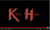
'Killer Heels' - Film Opening
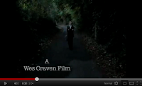
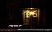
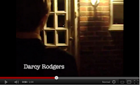
Here is our final version to the opening of our horror film, Killer Heels.
'Killer Heels' Trailer
As an extra piece we also decided to create a trailer for our film. Trailers are great source of advertisement and a great way to display the upcoming film to its target audience. This particular trailer would be best displayed in a cinema, preferably shown before a film of its genre (thriller or horror) to its intended target audience - males from 15 to 25. A cut down version of this trailer could be shown on television, after watershed due to the age prohibited content.
Killer Heels Analysis
 Shot: Warner Bro's (our chosen film institution)
Reason: Having a film institution/production company appear at the start is one of the main conventions of a film opening and we felt by including a prestigious institution that has a large following and a backlog of successful films (including films in the horror genre) will make our film opening look very professional and may draw in people who are fans of films produced by this label.
 Shot type: Institutions
Reason: We have also chosen include Twisted Pictures as our next institution as they are associated with horror films, with a reputation of creating high quality films in this particular genre. This could, then attract fans of this genre who recognise the companies name and associate their favourite films with this one and furthermore entice them to watch our film
 Shot Type: Panning Mid-Shot
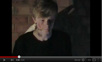
Shot Type: Close-up
 Shot Type: Panning Mid-Shot
Reason: We decided that a mid shot would be idyllic if used here as it would allow the audience to see the setting, character and situation clearly. The use of low-key lighting creates shadows which are very visually artistic, reflecting a sense of covering up mystery and hidden elements which are to be revealed throughout the film.
Shot Type: Close-up
Reason: We decided that the next shot that was needed was a close-up shot of our characters face. This type of shot is very effective in these types of situations, and we feel it helps to clearly show the emotion and terror of his facial expression. Being this close to the character and his emotions helps create a link between him and the viewer, allowing them to sympathise with him, and also because they are so up and personal with him, they feel on edge and on comfortable themselves, as they feel they are in the same situation as him.
Shot: Mid Shot
Reason: We then went straight from the close-up shot into a simple mid shot to finish this particular scene. Seeing as the scene initually began with a mid shot, this repetition gives the scene a sense of continuety and a well rounded flow.
 Shot Type: Plain, Black Screen
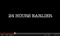
Shot: 24 Hours Earlier text
Reason: We all felt that to keep the progress of the narrative clear and easier to follow, this small bit of information informing the audience of the change it time periods was necessary. We chose used a plain black background, again linking with the negative associations, but also the fact that less is more and the simple style would not take away from the narrative at all, and would get the point across simply. The font of the text is also harsh and in a gothic style, linking back to the ideas of death and destruction.
Shot Type: Long Shot
Shot: Mid Shot
Reason: We then went straight from the close-up shot into a simple mid shot to finish this particular scene. Seeing as the scene initually began with a mid shot, this repetition gives the scene a sense of continuety and a well rounded flow.
Shot Type: Plain, Black ScreenReason: The scene ends just with a pitch black screen. This abrupt end gives a firm termination of the previous scene. The black screen could also foreshadow the dark and sinister narrative to come, building the tension of the upcoming scene.
Shot: 24 Hours Earlier text
Reason: We all felt that to keep the progress of the narrative clear and easier to follow, this small bit of information informing the audience of the change it time periods was necessary. We chose used a plain black background, again linking with the negative associations, but also the fact that less is more and the simple style would not take away from the narrative at all, and would get the point across simply. The font of the text is also harsh and in a gothic style, linking back to the ideas of death and destruction.
Shot Type: Long Shot
Reason: We decided to set this particular scene in a dark woods and night time, as it is an obvious location used in many horror films, causing the audience to feel uneasy and wary. The long shot works well here as it creates the illusion of a long, scary, winding path on which he has to travel, alone. The audience may also feel slightly alarmed by the fact that the character is shown walking straight towards them, maybe leading danger straight to them. The way the character is surrounded and engrossed by tall, intimidating trees creates the scene that he is trapped and being led into somewhere dark and will have trouble getting away from it. During this the credits have started, displaying the directors name which is a usual feature in film opening credits.
Shot Type: High Angle Shot
Shot Type: Extreme Close Up
Shot Type: High Angle Shot
Reason: This scene uses low key lighting to create a mysterious, unpredictable atmosphere, putting the audience on edge and nervous. This was the perfect time in which we could include a high angle shot. The use of high angle shots are common in horror movies, looking down on a particular person, usually the victim, making them look innocent, naive and vulnerable. We filmed it from a higher level through trees and bushes, panning along following the main character. This gives the illusion that he is being followed and watched
Shot: Low Angle/Panning
Reason: The camera was tilted upwards facing the dark sky, slowly tilting slightly downwards to reveal a clear shot of the house. This shot clearly shows the audience where this scene is supposed to be set. We cut straight to this shot, leaving the audience to assume that our character had successfully made his journey out of the wood to his house, meaning it was unnecessary for us to show the whole journey as this could get quite tedious. The light attached to the front of the house is the only source of light due to the fact that it was filmed at night time, giving a luminous, glowing effect, adding to the eerie nature.
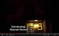
Shot: Establishing Shot
Reason: This shot links to the previous low angle/panning shot, which tilts downwards to reveal an establishing shot of the front door of the house. The normal, innocence of the everyday house adds to the disturbing idea that bad things can happen to anyone, again making the audience feel more vulnerable and helpless themselves.
 Shot: Long Shot
Reason: We needed to show the main character again so the audience did not lose the sympathy they had towards him. We liked the fact that it was so dark outside because this added to the tension and sense of mystery. The fact that you can see other houses in the frame adds a domestic feel to the scene and reinforces the idea that this could happen to anyone.
Shot Type: Over The Shoulder Shot
Shot: Low Angle/Panning
Reason: The camera was tilted upwards facing the dark sky, slowly tilting slightly downwards to reveal a clear shot of the house. This shot clearly shows the audience where this scene is supposed to be set. We cut straight to this shot, leaving the audience to assume that our character had successfully made his journey out of the wood to his house, meaning it was unnecessary for us to show the whole journey as this could get quite tedious. The light attached to the front of the house is the only source of light due to the fact that it was filmed at night time, giving a luminous, glowing effect, adding to the eerie nature.
Shot: Establishing Shot
Reason: This shot links to the previous low angle/panning shot, which tilts downwards to reveal an establishing shot of the front door of the house. The normal, innocence of the everyday house adds to the disturbing idea that bad things can happen to anyone, again making the audience feel more vulnerable and helpless themselves.
Shot: Long ShotReason: We needed to show the main character again so the audience did not lose the sympathy they had towards him. We liked the fact that it was so dark outside because this added to the tension and sense of mystery. The fact that you can see other houses in the frame adds a domestic feel to the scene and reinforces the idea that this could happen to anyone.
Shot Type: Over The Shoulder Shot
Reason: When our character was approaching his front door, we decided to include and over the shoulder shot. This particular shot type projects the idea that he is being followed and he doesnt realise.
Shot Type: Extreme Close Up
Reason: We are then shown a close up, focussing on his hand opening his front door. Linking it straight after the previous over the shoulder shot worries the audience as now they see he is opening his door to his mysterious follower. The intense focus on the act of him opening his door suggests to the audience that he is leading himself in to trouble and danger.
 Shot: Match on Action
Reason: Similar to in our preliminary task, there was a perfect opportunity for us to use a match on action shot of our character walking through the front door, adding to the continuity and a steady flow from the previous shot into this one. By filming our main character coming through his door inside, it suggests that even though he has safely made it home, he is not a secure as he thinks he is.

Shot: Tilt Shot
Shot: Match on ActionReason: Similar to in our preliminary task, there was a perfect opportunity for us to use a match on action shot of our character walking through the front door, adding to the continuity and a steady flow from the previous shot into this one. By filming our main character coming through his door inside, it suggests that even though he has safely made it home, he is not a secure as he thinks he is.

Shot: Tilt Shot
Reason: This shot is a lot brighter and gives a warm, welcoming feel to the atmosphere. This deeply contrasts with the previous shots before it. We decided to use a tilt shot here as it disorientates and confuses the viewer, as if they too are being lured in to a false hope of safety and security when that may not be the case

Shot: Long Shot

Shot: Long Shot
Reason: Here we have decided to include a long shot. This suggests that he is being watched from a distance as he gradually walks away from the camera. Also shooting the main subject in center frame gives a false sense of security, superiority and control. The warm, homely colours and soft, subtle surroundings also add to the illusion he has now let his guard down and is in a completely vulnerable state, but he doesn’t know it yet.

Shot: Mid Shot/Match on Action

Shot: Mid Shot/Match on Action
Reason: As the main character enters the next room, there is a slight change in atmosphere, with low key lighting conditions creating faint shadows, suggesting the unknown is lurking near, watching and waiting. We decided to again include match on action here as it creates a sense of repetition and adds to the sense of continuity.
 Shot: Over The Shoulder Shot
 Shot: Over The Shoulder Shot
Reason: Here, we have included a scene which we feel is effective and juxtaposes with scene of high tension like the woods scene. The inclusion of an everyday, domestic task gives a sense of normality to the everyday life of this character, and may allow the audience to relate to him as a fellow member of society. From a scene, walking alone in a dark, eerie woodland domineered by tall intimidating trees contrasts with the pure normality of this task which can be quite unsettling for the audience, suggesting that dark, terrible things can happen to anyone, and that none of us are 100% safe at any given time. The over the shoulder shots helps reinforce the idea that our character is being watched, with the mysterious force breathing down his neck, watching his every move.
 Shot: Point of View Shot
 Shot: Point of View Shot
Reason: Here, we have decided to use a point of view shot. This is a powerful camera angle which many horror films use to help create a relationship between the character and the viewer. It allows them to connect and sympathize with him on a personal level, and know what he’s going through from his perspective. Being close to a character in this way then puts the audience on edge as they feel like they are in that place themselves, and very vulnerable. We have included a clip from another horror film of someone being murdered. This is a symbol, foreshadowing death, blood, torture and negative themes to come. This again builds tension in the viewer as all these signs are coming together
 Shot: Low Angle Shot
 Shot: Low Angle Shot
Reason: In horror, low Angle shots are usually used to depict the villain or killer, giving them superiority, status and power, however we have decided to use it showing our victim walking up the staircase. This could suggest the character is in power and safe. This will make the shock ten times worse when they realize he is actually walking towards his fate. It could also be interpreted as a point of view like camera shot, from the killers perspective, hiding and lurking at the bottom of the stairs, waiting for an opportune moment to pounce.

Shot: Mid Shot

Shot: Mid Shot
Reason: In this shot, we see the character looking most vulnerable, in a fetal like position, with only a soft duvet as his shield from the dangers of his surroundings. The light puts him in the spot light, whereas the rest of the frame is engulfed in darkness, adding to the idea of the unknown.

Shot: Plain Black Screen
 Shot: Film Title

Shot: Plain Black Screen
Reason: The plain black screen has been put here mainly to show a change in time (suggesting that the character has been asleep for a longer period of time), but also indicates the end of one scene and the start of the next. The fact that the audience are put in pure darkness, not knowing what is going to happen next, adds t the tension and keeps them glued to the screen, eager to find out what happens next.

Shot: Close Up Shot

Shot: High Angle/Aerial Shot
 Shot: Low Angle/Point of View Shot

Shot: Close Up Shot
Reason: We used black and white setting to signify this is late at night. It almost looks like a video camera. The camera was positioned on a tripod, looking through the bars of the end of the bed, adding to the idea of being watched. We have included a close-up shot of the characters face. This shot was perfect in this situation as it clearly shows the characters emotion and facial expression, allowing the audience to sympathize and pity him.

Shot: High Angle/Aerial Shot
Reason: The whole of the bedroom scene is shot in black and white, adding to the eerie, sinister atmosphere of being alone in the dark. As our victim is in a particularly vulnerable state (asleep and unaware of his surroundings), we chose to include a high angle shot. It makes the character look small, defenceless and suggests he is close to danger.
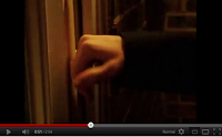
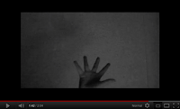
Shot: Low Angle/Point of View ShotReason: This scene causes the most tension throughout the film in my opinion. We wanted to show our victim being captured in an interesting way (instead of the obvious), so decided to use a low angle shot/point of view shot. We feel it looks very visually effective, giving status and power to the killer, as well as making the audience feel uneasy. Just showing the hand also keeps an air of mystery to who the killer is, adding to the mystery and fear of the unknown. The tension builds as the hand slowly travels closer and closer to the lens. This contact with the camera makes the viewer feel like they are personally in this situation, as if the hand is reaching out for them.
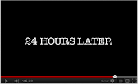
Shot: 24 Hours Later
 Shot: Close Up Shot
 Shot: Low Angle/Close Up Shot
Shot: 24 Hours Later
Reason: Here we have repeated a message similar to the one before. We have used the same styled gothic font, reflecting the connotations of death and darkness, as well as using the contrast to the white text on the black backdrop. The simplistic elegance of the text makes sure not to take away any focus from the narrative. This is purely to decipher a change in time period, keeping the audience aware of what’s going on in the narrative.
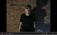
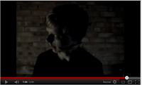
Shot: Close Up ShotReason: We have shot our victim close-up, in centre frame. This shows his fearful expression and portray his feelings clearly. I love the colour scheme of this scene, with washed out, low saturated levels of colour. This could suggest he is delirious and confused in his beaten, disturbed state of shock and fright. The brick wall background has quite an industrial feel to it, which is a typical horror film setting. The murderers garage is a great location as the hard, cold and lifeless texture and structure of the brick wall mirror the harsh cold hearted nature of the killer.
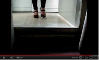
Shot: Low Angle/Close Up ShotReason: I think this particular shot is very artistic and effective. As to keep the identity of our killer a mystery (to keep tension) we decided to show a low angle shot of just the killers feet. Mirroring the film title, the red heels a bright and stand out against the dull backdrop. These are the key symbol which are associated with the film’s title and allow the audience to use their imagination and come up with their own image of the killer (which elicits anxiety from everyone’s personal fears). The fact that she is walking directly into the camera alarms the viewers as they feel almost as if the killer is walking towards them.
Shot: Film TitleReason: At the end of the opening we all decided this would be the appropriate place in introduce the title of the movie. It fades in from the darkness, adding to the mysterious nature of the situation. The font is in bright red, reflecting that the film is not for the faint hearted, containing death, blood torture and gore. The colour also links into the provocative, seductive nature of the film. The harsh sharp edges of the lettering could symbolize the shard weapon (heel) of which the killer uses on her victims. The backdrop is silent, apart from the sound of heels pacing across the floor. You cannot see what’s happening, but the sound of the heels gets nearer and louder, creating anxiety and apprehension in the audience.
Friday 6 January 2012
January 6th
Here is a final copy of our film title: We had already decided on a name for our film title in the previous stages of our film planning so in this lesson, we focussed mainly on creating a logo for the film, which we would import it into Final cut Express. As stated previously we all agreed on the red font of the text - which reflects the killer's red high heels aswell as the blood and death, against a black background - which could again reflect the dark, sinister atmosphere of the narrative. We looked on the website, 1001 fonts which we hoped to include in our films title. We found a perfect font, which we print screened. We decided just to use the new font on the K and H ( the first letters of the two words in the title). This helped highlight the words and looked better as opposed to using the font for the whole title as it was in block capitals and looked like an amiture attempt. We chose this point as the sharp edges on the letters almost represent the heel and the dangerous nature of it as a weapon. The title was on a white background, which didnt look right. we considered leaving it in this state but felt it would look most effective with a black backdrop. To overcome this we had to edit the title in Microsoft Word and change the background to black to solve this complication. I'm glad we did as it looks so much better as a final cut compared to with a white backdrop.
We then started to add transitions to our opening to make it run along smoothly. We looked at all the available transitions in Final Cut Express and decided to use 'Fade In and Out'. We found this to be an effective transition because it clearly showed when the scenes were changing, while still enabling it to run along smoothly.
We had already decided on a name for our film title in the previous stages of our film planning so in this lesson, we focussed mainly on creating a logo for the film, which we would import it into Final cut Express. As stated previously we all agreed on the red font of the text - which reflects the killer's red high heels aswell as the blood and death, against a black background - which could again reflect the dark, sinister atmosphere of the narrative. We looked on the website, 1001 fonts which we hoped to include in our films title. We found a perfect font, which we print screened. We decided just to use the new font on the K and H ( the first letters of the two words in the title). This helped highlight the words and looked better as opposed to using the font for the whole title as it was in block capitals and looked like an amiture attempt. We chose this point as the sharp edges on the letters almost represent the heel and the dangerous nature of it as a weapon. The title was on a white background, which didnt look right. we considered leaving it in this state but felt it would look most effective with a black backdrop. To overcome this we had to edit the title in Microsoft Word and change the background to black to solve this complication. I'm glad we did as it looks so much better as a final cut compared to with a white backdrop.The next step was to most importantly include the credits in our film opening, which are a key code/ convention for any film opening. A small percentage of film openings include a lot of people accociated with making that particular film in the opening credits, however, we have decided to only include the main actors, directors/producers and film institutions at the start of our film. If everyone accosiated with the film was listed in the opening credits, it would go on for too long and the audience may lose interest which is why most films include the most important people in the beginning credits and tend to list everyone in the end credits of a film. After viewing a selection of horror films, we noticed that alot of the credits introduce new, young actors breaking into the business, which gives a fresh, new edge to the film which may appeal to our younger audience, so we have included this in our opening. The colour of our credits are just a plain simple, white font. This white text stands out on the dark, contrasting backgrounds of the opening and doesnt take away from the narrative. We decided to place the credits in the bottom left of the frame, so it could still be clearly seen, yet not take the audiences attention away from the narrative too much. We also decided to have the a major production company, Warner Bro's appear at the start of our film opening as it shows class, quality and may appeal to fans of various films produced by Warner Bro's. We managed to find an edited Warner Bro's longo used in the Harry Potter saga of films. It is the same logo but edited to look dark, eroded, warn down, hard and cold with an air of mystery and darkness, which we felt was more suitable and reflects the genre and nature of our film.
After creating our film title and chosen film Production Company, we started to add transitions to our opening, linking clips and scenes together smoothly which made it run together slickly. After viewing all the possible options of transition from one cut to the next, we decided to use the option, ‘fade in and fade out’. We felt this was the most visually appealing transition, displaying the cut of one clip to another, whilst keeping the editing smooth and sleek. I feel that the simpler the better and that editing should not be noticeable unless intended to be.
Whilst experimenting with music, we decided to leave the bedroom scenes silent as this added to the tension, making the scenes for sinister and terrorfying. It also took a lot of time and patience to get the heels to syncronise with the actions on screen but we managed to get it very accurate after altering timings. We discovered almost by accident that the heels over playing as the screen fades in and out adds tension and is an interesting element which can be used to elicit fear and excitement from the audience.We then started to add transitions to our opening to make it run along smoothly. We looked at all the available transitions in Final Cut Express and decided to use 'Fade In and Out'. We found this to be an effective transition because it clearly showed when the scenes were changing, while still enabling it to run along smoothly.
Thursday 5 January 2012
January 5th
We continued editing it in today's lesson as we were unable to in the christmas holidays. We only had a few more clips to cut and place onto the timeline. We had to make some of the clips lighter as they came out too dark when we put them into Final Cut Express, so we edited and adjusted the colour levels after we finished cutting our clips. The use of black and white for the night scenes we feel is powerful and works really well, sneakily giving the illusion of night time and adding a darker, sinister atmosphere to the scene.
Seeing as all of our clips were cut down, positioned correctly and linked together, we decided now it would be a good time to add music to our film opening. Our chosen music clips were not long enough to carry out for the whole of our film, so we looped some of the music together. some of the music we had repeated did not suit certain parts of our film so we searched for some other suitable previews on iTunes. The ambient sounds in some of the clips is too loud and diverts from the narrative, so next lesson our intention to solve this concern.
There are various things that we plan to continue in the upcoming lessons, including the film name (logo), production companies, credits and the transitions. only tasks that need completing now are the credits, film name, production companies and the transitions. As a group we decided on the font and colour- red on a black backdrop as we feel this fits perfectly in with the dark theme of the film, blood, death and also links into the idea of the red hig heels (the main element of our narrative) which we plan to import into Final cut Express from a memory stick.
Next lesson we plan on completing all of the elements of our final film i mentioned previously due to the fact that we are presenting and showing our final film opening in class on Monday 9th January. I look forward to this as it allows us to get feed back from fellow class mates and our teacher, which may help, hearing different peoples perspective of our piece, allowing us hopefully to improve elements which may have gone un noticed. We may also receive inspiration from other groups openings which we could use in our favour to improve our film.
Subscribe to:
Posts (Atom)